How to Build a Successful Landing Page for FREE: 11 Tips for Conversion Optimization
Learn how to make a landing page with our expert tips and best practices. Increase your conversion rates and drive more leads to your business.
A landing page is a web page that is designed to convert visitors into leads or customers. Landing pages are usually built for specific campaigns, such as an ad campaign or a social media post. They can also be used to collect information from visitors in order to build out an email list.
A successful landing page gives you control over what happens when someone clicks on your link or ad, and it helps you track the effectiveness of your campaign by showing you how many people have visited the page

What is Landing Page?
A landing page is a web page that acts as a funnel for visitors to convert into customers.
Create Landing page can be used for many different purposes, but they all share the same basic elements:
A clear call-to-action (CTA) button or link that tells visitors what you want them to do next. This could be something like “Download Our Whitepaper,” “Sign up for our Newsletter,” or even just an email address field where they can enter their information if they want more information from you later on down the line.
An offer of some kind–whether it’s free resources like ebooks or white papers, discounts on your products/services, etc.–that will entice people into taking action now instead of later when they’re less motivated by their desire for savings or other benefits offered by this particular deal.
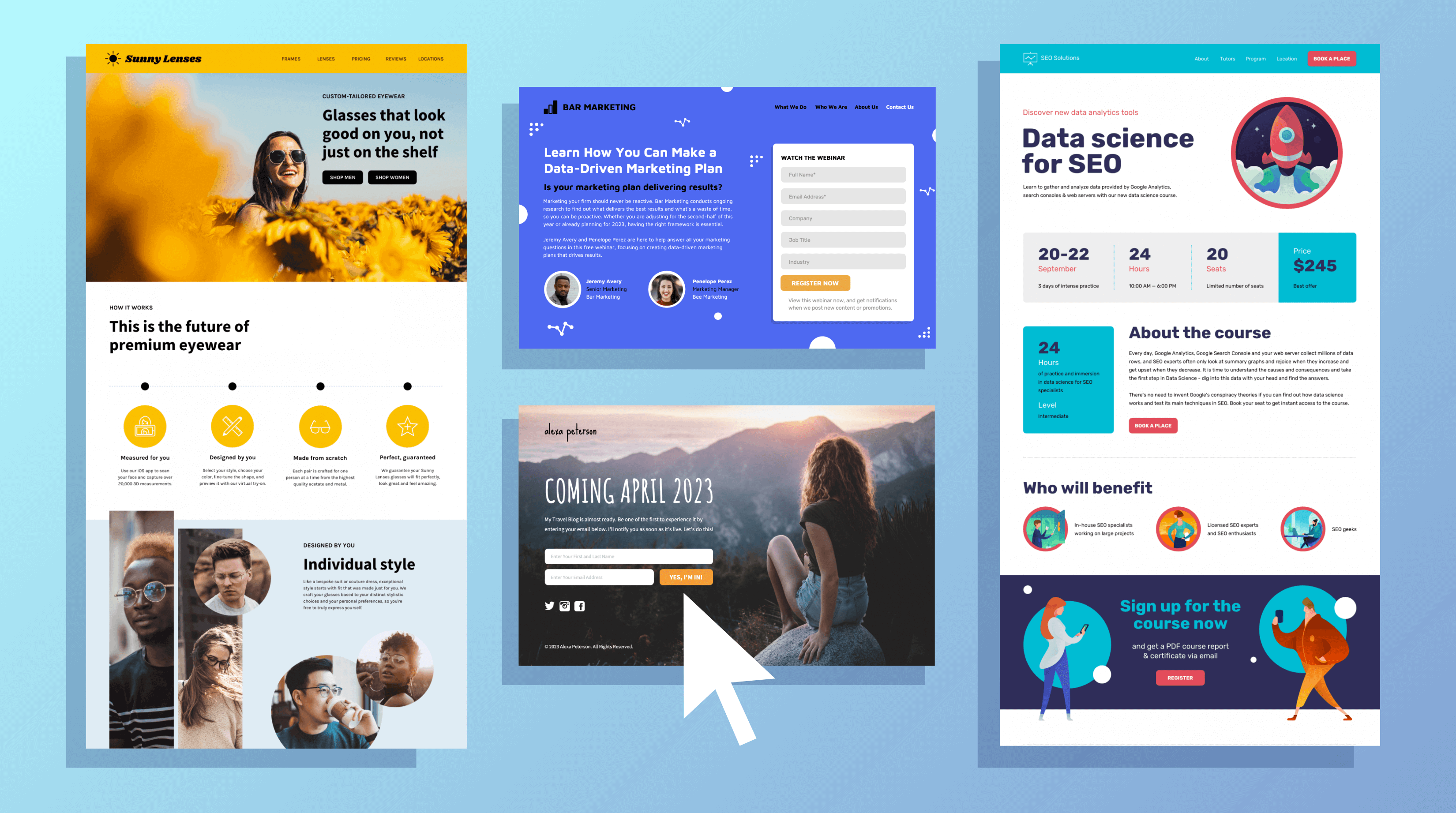
Here are some landing page examples:
Lead generation landing page: This type of landing page is designed to capture leads. It typically includes a form that visitors must fill out in order to access a free resource, such as an ebook or whitepaper.
Click-through landing page: This type of landing page is designed to convince visitors to click through to another page, such as a product page or checkout page. It typically includes a strong call-to-action (CTA) that encourages visitors to take the next step. Sales landing page: This type of landing page is designed to generate sales. It typically includes a product description, pricing information, and a prominent CTA that encourages visitors to make a purchase.
Why do you need a landing page?
“Why create a dedicated form page? Why not just use your homepage or about page?” These are excellent questions. However, after reading this article, you will likely have the answers. In short, a landing page removes distractions such as navigation, competing links, and alternate options to capture the visitor’s undivided attention, leading them to where you want them to go- your lead form. Therefore, landing pages are crucial for creating conversions.
Now that you comprehend their significance, it’s time to discuss landing page best practices to ensure your pages are optimized for conversion.
How to make a landing page for free?
Creating a landing page for your campaign or offer doesn’t have to cost you anything. You can use free landing page builders like Wix landing page, Hostinger WordPress, or Leadpages. These builders have many features that you can use, such as drag-and-drop editing, templates, and form builders.
First, choose a template that fits your specific campaign or offers from the variety of templates offered by the landing page builder. Then, customize it by adding your own images, copy, and branding elements. If you’re creating a lead generation landing page, you’ll need to add a form that visitors can fill out to access your offer. Fortunately, most landing page builders offer form builders that make it easy to create and customize forms.
To encourage visitors to take the next step, include a strong call-to-action (CTA) that stands out from the rest of the page. It’s important to test your landing page to make sure it’s working properly. You should test the form, the CTA, and any other elements to ensure they’re functioning as intended.
11 Tips to Optimize a landing page for more conversions

1. Catchy Headlines
To grab your visitors’ attention and prevent them from leaving your landing page, you need to craft a headline that focuses on the benefits they’ll receive. Within seconds of arriving, your visitors should know how your offer will make their lives easier, better, or more fulfilling. Your headline should effectively communicate the value of your landing page and offer in a clear and concise manner.
2. Add Images
It’s crucial to include an image on your landing page, and the image you choose should reflect your target audience. The image’s goal is to evoke a specific emotion that represents how your visitor will feel after taking advantage of your offer. Some images may be more effective than others, so it’s a good idea to test different options and see which one resonates best with your audience.
3. Ideal Copy
After spending so much effort perfecting your headline and choosing the ideal image, it would be a shame to lose potential conversions because of the ineffective copy. Your text needs to be straightforward, and brief, and direct visitors toward the desired action. Persuasive copy speaks directly to your audience by using “you” and “your,” which helps to engage them. Later on, we will discuss some more tips for writing effective copy.
4. Lead Form
Make sure your lead form is easily accessible to your potential customer so they can convert quickly without wasting time searching for it on your landing page. Ideally, the form should be located “above the fold,” meaning it’s visible without requiring the user to scroll down. You can achieve this by placing the form or a link to it at the top of the page. To make it even more convenient, consider designing your form to scroll with the user as they navigate down the page.
5. Call to action
The call-to-action (CTA) button on your landing page is a crucial element in encouraging visitors to convert. It’s important that the CTA stands out, and to achieve this, you should use a color that contrasts with other elements on the page. You also need to be clear about what you want your visitors to do by using an action verb that spells it out for them, such as “submit”, “download”, or “get it now”. To learn more about best practices for your CTA, keep reading.
6. Give offers
can improve your conversion rates and help guide your leads toward your ultimate goal of selling your product or service. When creating your offer, make sure it’s aligned with your business and relevant to your target audience’s interests. For instance, if you sell horseshoes, your offer could be “10 Tips for Healthier Horse Hooves.” This offer not only provides value to your leads but also positions your product as a solution to their needs. Keep in mind that your offer should entice your leads to provide their contact information, so make it as compelling as possible while staying true to your brand and business objectives.
7. Remove all Navigation
The sole purpose of your landing page is to convert visitors into leads. To achieve this, it’s important to eliminate any distractions that could steer your visitors away from your call-to-action. This includes removing any other links on the page, including internal links to other pages on your website. By doing this, you can keep your visitors focused on your offer and increase the chances of converting them into leads.
8. Make the Page Responsive
It’s important to ensure that your landing pages are responsive and can adapt to different devices and screen sizes. This is especially crucial for mobile devices since they have a smaller screen size, and you don’t want your visitors to miss out on the opportunity to convert.
9. Add thank you page
A thank you page is an essential element of your landing page strategy as it provides several benefits for both you and your leads. Instead of just displaying a thank you message or skipping the step altogether, a separate thank you page allows you to achieve three crucial objectives:
- Firstly, it provides immediate delivery of the offer you promised, usually in the form of an instant download.
- Secondly, it presents an opportunity to interest your new lead in additional relevant content that they might find valuable.
- Finally, it shows your appreciation for their interest, which can significantly impact their decision to become a customer in the future.
10. Social Proof
Research suggests that social proof is a powerful tool in persuading people to take action. It can take various forms such as logos of brands you’ve partnered with, testimonials from satisfied customers, reviews of your product, or evidence that others have purchased your service. Essentially, people are more likely to trust and engage with your solution if they know that others have already benefited from it. By incorporating social proof on your landing page, you’re able to validate your offer and build trust without needing to explicitly say anything.
11. Add Video
Video marketing is rapidly gaining popularity and for good reason. Not only do customers prefer to see videos from companies, but 88% of video marketers claim that video provides a positive return on investment. However, it’s crucial to create an effective video that doesn’t distract visitors from your ultimate goal: the call to action.
If you’re uncertain about using video, here are some reasons that might convince you:
- Video increases conversion rates.
- It’s a more personal way to share a message and connect with prospects.
- It can be more engaging than an image, encouraging visitors to click and convert.
- It can reduce the number of support calls or tickets you receive.
- It’s processed 60,000 times faster than text.
If you plan to use videos, VidYard provides useful guidelines to follow for landing pages. Excited yet about all the ways you can enhance your landing pages? Although there are several tactics, a poorly performing landing page doesn’t have to stay that way. Take it one step at a time and expand as necessary.
A/B Testing Your Landing Page
All the strategies we’ve discussed so far may be great in theory, but it’s important to remember that every business and target audience is unique. How can you be sure that the copy you’ve chosen is effective, or that your CTA placement is optimal? How do you know which colors or images work best for your audience?
The answer is simple: testing. Split testing, also known as A/B testing, is a common practice among marketers and can be an invaluable tool for optimizing your landing pages.
Here’s a quick overview of how to conduct effective A/B tests on your landing pages.
How to test?
To conduct effective split testing, it’s crucial to make small changes with each experiment. Avoid testing multiple elements simultaneously, such as your headline and image, as it becomes difficult to attribute results to a specific change. Instead, focus on testing one element at a time. Once you have determined the winning variation, it becomes the new control, and you can create a new challenger to test the next element. Repeat this process until you achieve a conversion rate that satisfies your expectations, while also being realistic, which we will discuss in more detail below.
What should you test?
Although you can test almost anything on your landing page, it’s best to focus on a few high-impact elements, such as:
- Headline copy
- Images
- CTA color
- Click triggers
- Copy on the page
- Length and fields of lead form
These elements are the ones that can have the most significant impact on your conversion rates. To start, it’s a good idea, to begin with simple changes, such as testing your headline or CTA color, before moving on to more substantial changes, such as testing your page copy.
Add analytics to track and improve
Accurate metrics are crucial to determine the effectiveness of your landing page and identify areas for improvement. It can be challenging to predict what will resonate with your audience when launching a new page. In the beginning, it is important to track and analyze metrics meticulously until you reach a satisfactory conversion rate. Once you’ve achieved a stable rate, you can track metrics less frequently.
Conclusion
Building a successful landing page is essential for any marketing or advertising campaign. By following these tips, you can create a landing page that’s optimized for conversion and generates leads or sales for your business. Remember to focus on creating a clear and compelling offer, using persuasive copy and visuals, and testing and analyzing your results to continually improve your landing page’s performance.

